
Blog
Random chat layout choices that keep the conversation area usable
A compact chat-first design guide for keeping effects visible without letting them replace real messages.
Published: 2026-07-29 · Updated: 2026-09-16
Key points
- Reserve the largest area for messages
- Render effects as overlays instead of fake chat bubbles
- Keep safety controls close to the input
Live chat screens fail in one specific way: everything wants to be visible at once, and the message list loses. Effects, presence indicators, banners, and prompts each seem small, and together they push the conversation into a strip in the middle of the screen. Since the messages are the reason anybody is there, the layout has to be decided in favour of the message column and defended against every later addition.
Give the message column the majority of the screen and hold that line
Decide the share of vertical space the conversation gets and treat it as fixed. On a phone the message list plus the input should own the clear majority of the height, which means the header has to be one line, presence has to be a small indicator rather than a panel, and anything promotional has to be dismissible or absent. Count the rows of chrome above the first message; two is workable, four means the chat has become a feature of the page rather than the page itself.
The number that matters is how many messages are visible at rest. Fewer than about four or five and the conversation stops reading as a conversation, because there is no visible context for the message on screen and users start scrolling constantly to remember what was said. Measure this on the smallest screen you support, with the keyboard open, since that is the state people actually type in and it is the state design reviews skip.
Render effects as an overlay that cannot move the text
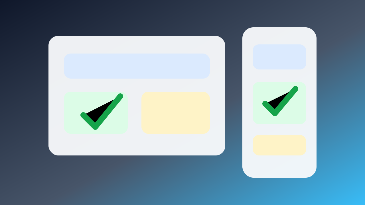
Animations, reactions, gifts, and celebration effects belong on a layer above the conversation, positioned independently, so that nothing they do changes the position of a message. The failure to avoid is the effect injected into the message list as a pseudo-message, which reflows the column, pushes the line somebody was reading off the screen, and leaves a permanent gap in the history once the animation is over.
Bound the effects deliberately. A maximum duration, a cap on how many can play at once, a queue for the overflow, and enough transparency that text remains legible underneath. Also make sure effects never sit under the input or the send control, because an animation that intercepts a tap turns into a message sent to the wrong place or not sent at all, and users read that as the app being broken.
Get the scroll behaviour right in both directions
When the user is at the bottom, new messages should arrive and stay in view. When the user has scrolled up to read history, new messages must not yank the view down, because that is the single most infuriating behaviour a chat can have. The standard resolution is to hold position and show an unread indicator that jumps to the newest message when tapped, and it needs to work while effects are playing rather than only when the room is quiet.
Mark where the unread messages begin with a divider that survives a scroll away and back. In a fast room, a user who looks away for a minute needs to know where to resume, and without a divider the only options are reading everything again or giving up on the last minute entirely. Keep the jump-to-latest control in a fixed corner so it is where the hand expects it.
Put the safety controls where the trouble happens
Block, report, and leave belong within reach of the input and of the individual message, not buried in a settings screen two taps away. The moment someone wants them is the moment they are least willing to go hunting, and a control that takes three taps to find will be replaced by closing the tab, which means you learn nothing and the other person continues.
Make the result immediate and legible. After a block, the messages should disappear from the visible conversation at once rather than after a refresh, and the interface should say what happened in one short line. Keep the report path short enough to complete in a few seconds, and separate leaving the conversation from reporting it, since bundling them forces a person who just wants out to file paperwork first.
Before you commit
- Reserve the largest area for messages
- Render effects as overlays instead of fake chat bubbles
- Keep safety controls close to the input
Protect the message column, keep effects on their own layer with hard limits, make scrolling respect the reader in both directions, and keep the safety controls next to the input. Do those four and the effects stay fun instead of becoming the reason people leave, which is the whole balance a chat-first screen has to strike.